It appears to me that as time passes by that the previous time period of the same length appears to have been greater than the current or most recent time period. This experience becomes normalised as you experience more and more years until they appear to be mostly the same length, but passing quickly because they’re just a small small fraction of your overall life span so far.

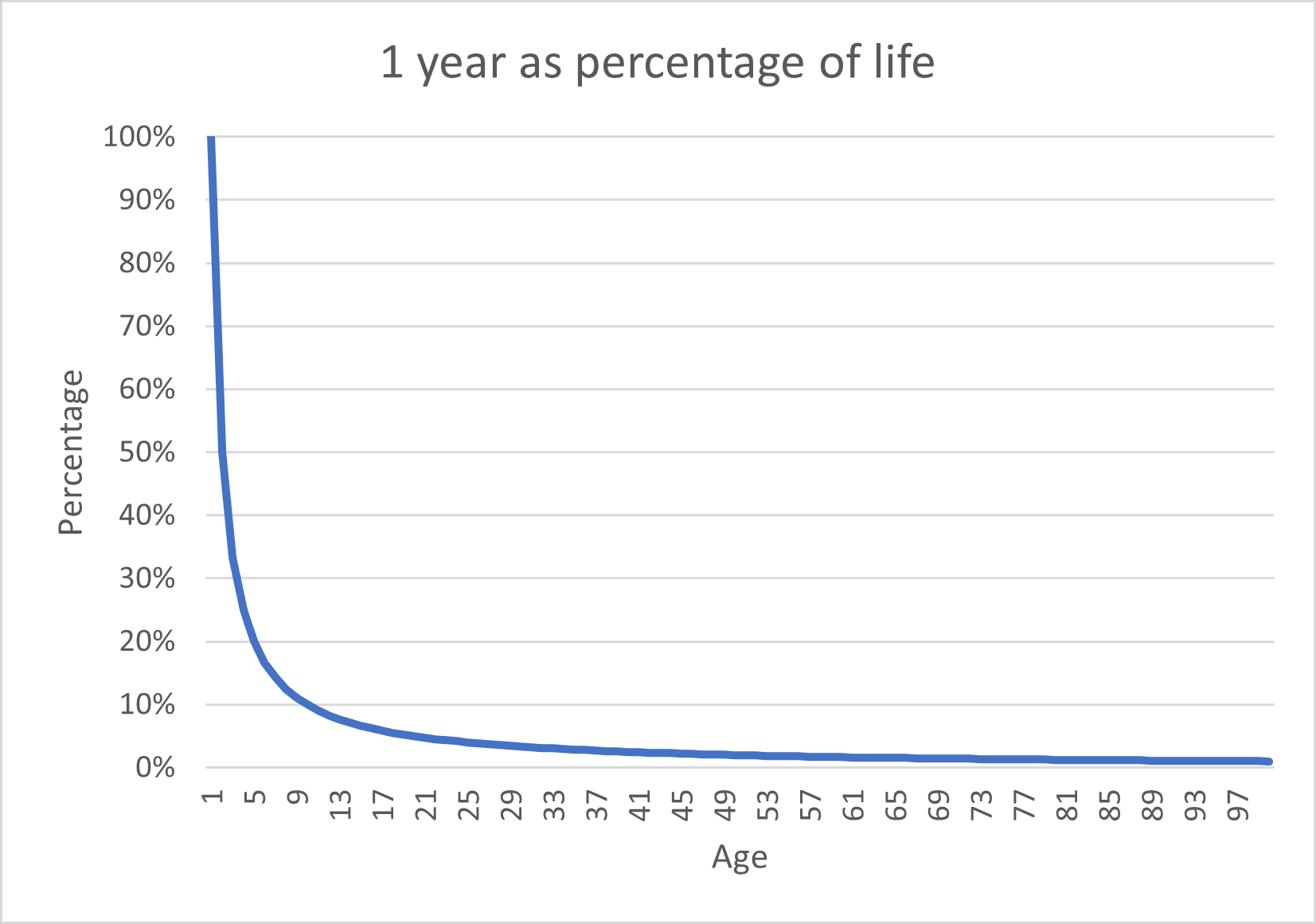
The above graph shows the rate of change when you’re very young is very high this tails off as you pass about 10 years old where there would appear to be a 1:1 ratio of years of age to life span. The percentage quickly reaches low numbers of 5% at age 20 and so the next 80 years as spend gradually reducing that number to 1% at age 100.

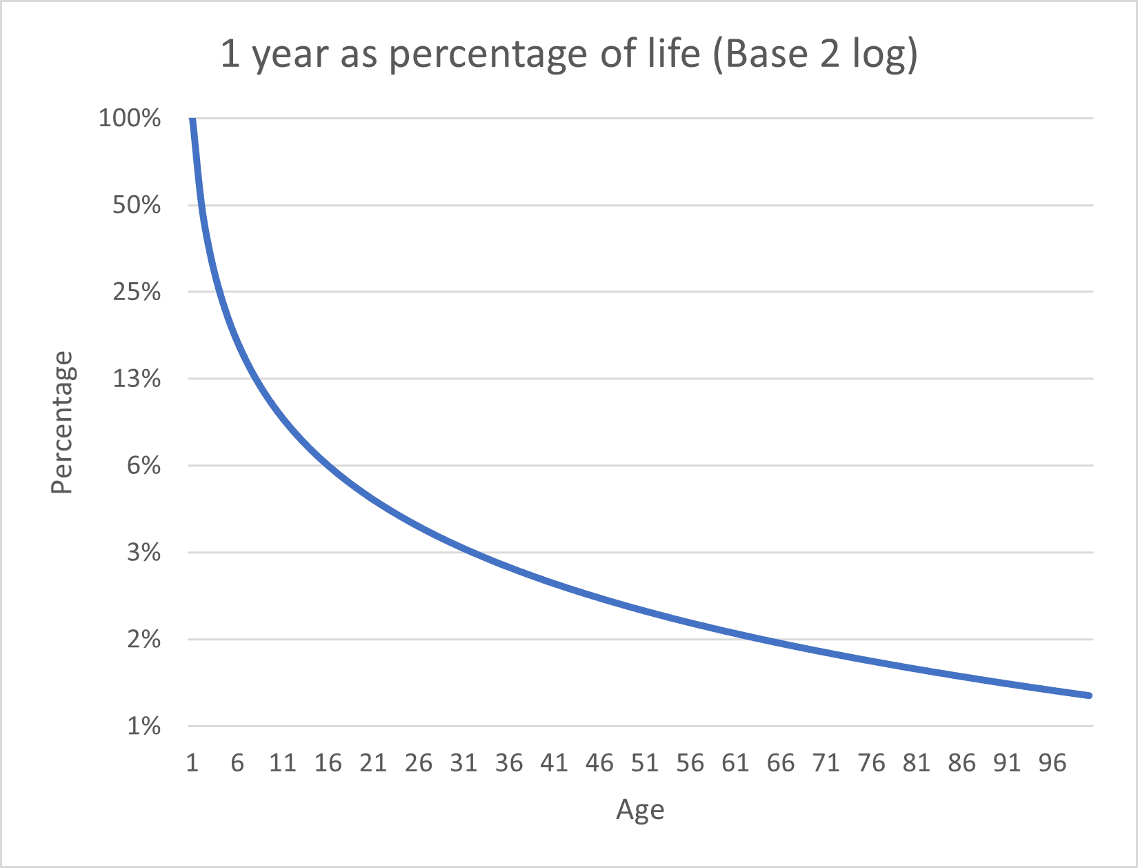
The above graph is the same data, but presented on a base 2 logarithmic scale. This shows the rate change more clearly.

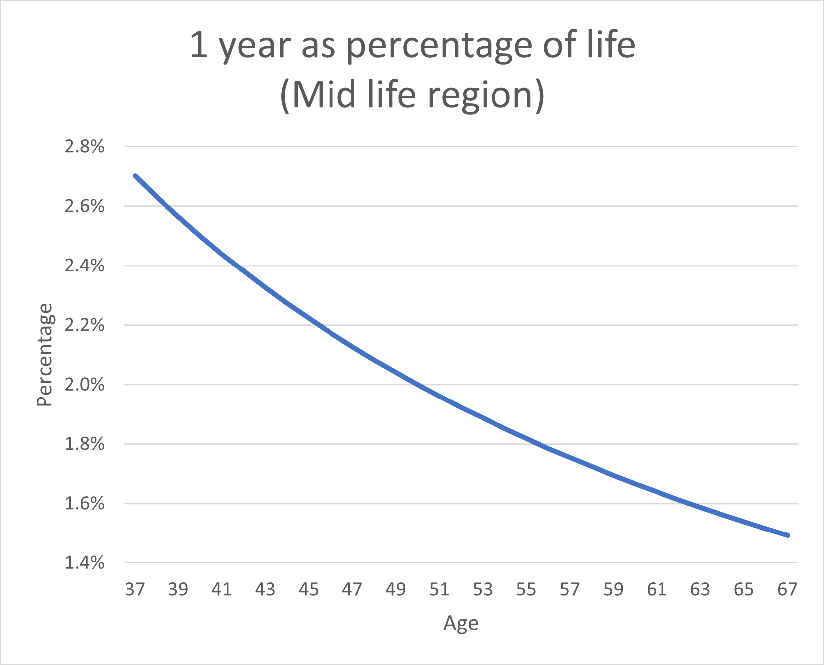
The above graph shows the rate change during the middle life region, at this scale on the y axis it’s possible to see that the rate of change does continue to change, this may explain the continuous speeding up of time, as each year is shorter than the last when viewed from the current year. Given that you probably don’t really remember the passing of time very well in your early childhood if you’re old enough to have your age shown on the above graph, then we can assume that you’re comparing it to a time when you can remember in your more recent life, perhaps where a year was 5% of your life, so the change is from 5% to perhaps 2.5%, thus time is appearing to move quicker than the first graph might suggest.
Comments are closed